
|
Tutorial 3: Visualization |
|
A cool part of CisGenome is its browser (i.e., CisGenome Browser) which can be used to visualize a variety of data easily (e.g., array signals side-by-side with gene structure, cross-species conservation score and DNA sequences; raw array images; sequence logo of transcription factor binding motifs, etc.). The browser is not only linked to CisGenome GUI, but can also run independently without using CisGenome GUI.
When you start CisGenome GUI, the browser will be started automatically (Note: in Windows Vista, a dialog may jump out to ask whether to block the program or not, please check “Unblock”). Alternatively, if you want to use the browser independently, you may go to the folder where CisGenome.exe is installed. There you will be able to find a subfolder called “browser”. Enter the browser folder, and double click “display_server.exe”. The browser will then start, and you will be able to find a black “CGB” icon on the lower right corner of your screen, located together with many other shortcut icons. When you double click the icon, an Internet Explorer window will show up and you will see the browser page.
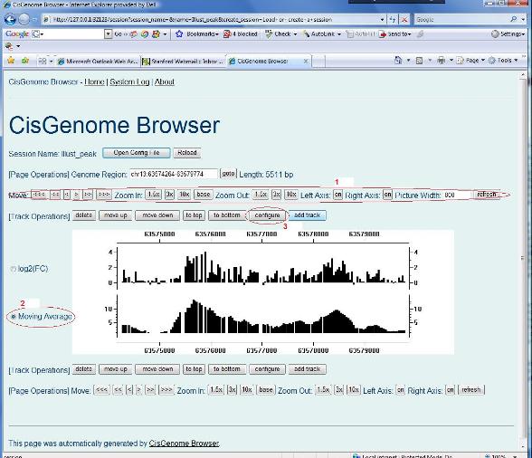
OK, you are now ready to learn more about the browser. In the previous section, you have got a list of peaks which are opened with CisGenome GUI. Now, please randomly choose one, and double click it on the first column, you should be able to see a plot similar to the figure below. There are a series of buttons on the top and on the bottom of the plot (see red circle 1) which can be used to zoom in, zoom out, move left and move right the display area. These buttons are self-explanatory, please try them to see what will happen.
You can also change the display style of any track. In order to do so, first choose a track by clicking the corresponding radio button (see red circle 2), then click “configure” (red circle 3). A configuration page will show up to let you adjust the display options. |
|
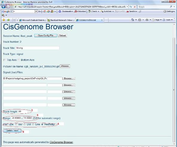
In the configuration page, you can change the height of the track (red circle 3 below), you can change the plot type (red circle 4), and you can also set the range of the display (red circle 5). By default, the range is set as “0.0 - 0.0”, this means that the browser will automatically determine the range of the data, and choose the minimum and maximum labeling of the Y-axis accordingly. When you change it, say, if you set the range to be “-5.0 - 5.0”, the minimum and maximum of the Y-labeling of the track will be fixed to –5 and +5 respectively. In this way, you can display data in different tracks on the same scale. After you modified your parameter settings, you can click the “Update Track” button (red circle 6). A new plot will show up. Look to see what happens.
|
|
Finished your exploration? Superb! Many of you will ask now: how can we display tiling array signals side-by-side with gene structures, conservation scores and DNA sequences? A good question! Let’s find it out how. |